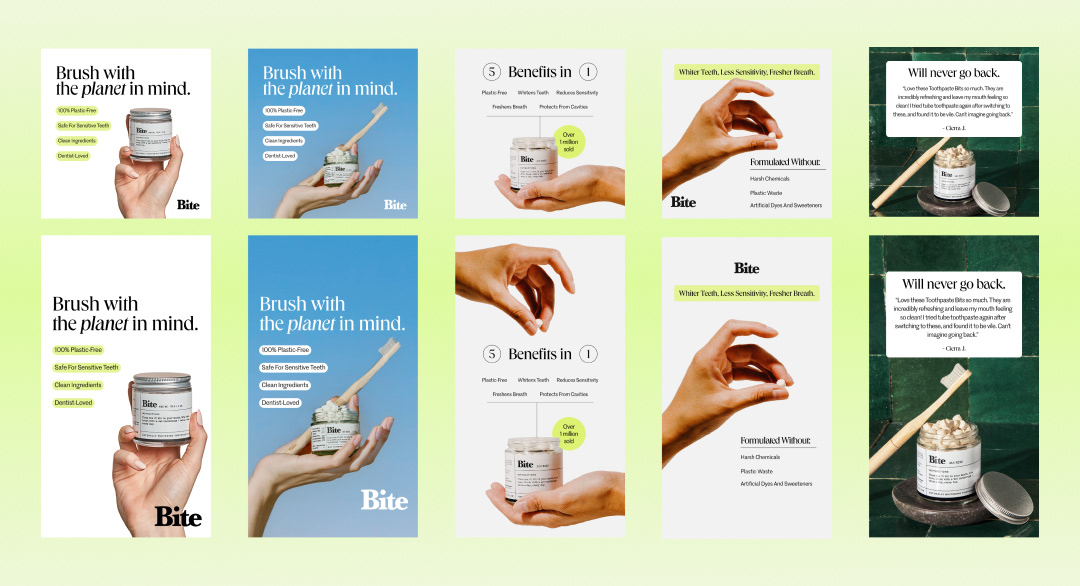
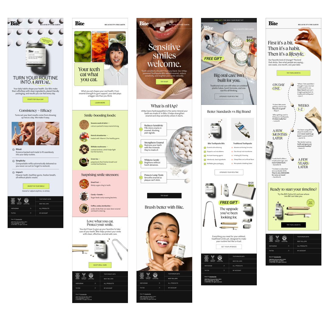
Problem: Bite wanted to bring a clean, modern, editorial approach to their email and ad designs. Their previous branding highlighted a more standardized template design that didn't allow for much creative freedom. They wanted to bring in more full bleed emails, grids, graphs, and utilize their lime green color more as an accent rather than a forgotten color within their brand system.
Solution: To keep the brand fresh I experimented with different ways of using their imagery to best serve each email. By using full bleed imagery, gradients, bold typography, and organizing lengthy copy I was able to bring their creative vision to life.
Creative Direction | Figma | Adobe Photoshop | Adobe Illustrator
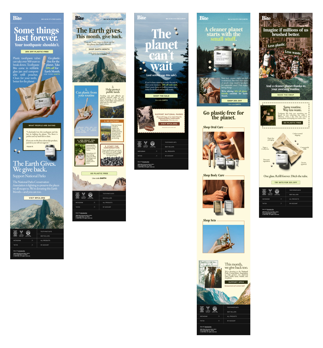
Additional campaigns included April's Earth Month which used editorial elements from 1970's ads, magazines, and marketing materials to give a vintage "save the earth" idea.