Problem: RG Construction, located in Texas, used to focus on commercial construction projects. With the introduction of the founders son joining the team and pivoting towards residential clientele the company needed a new name and a new look. The previous logo was "RG Construction" and included a logo mark of skyscrapers.
Solution: With the name change and switch to residential it was imperative to create a new mark that not only would be easily recognized and reimagined without losing the brands current integrity, but also allowed for the idea of family to be represented within the final design.
Creative Direction | Adobe Illustrator
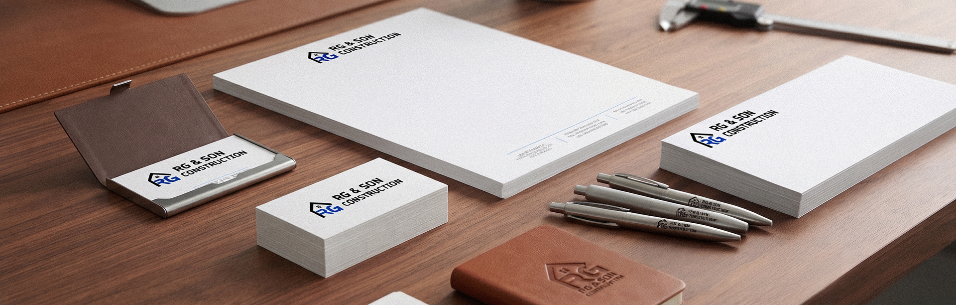
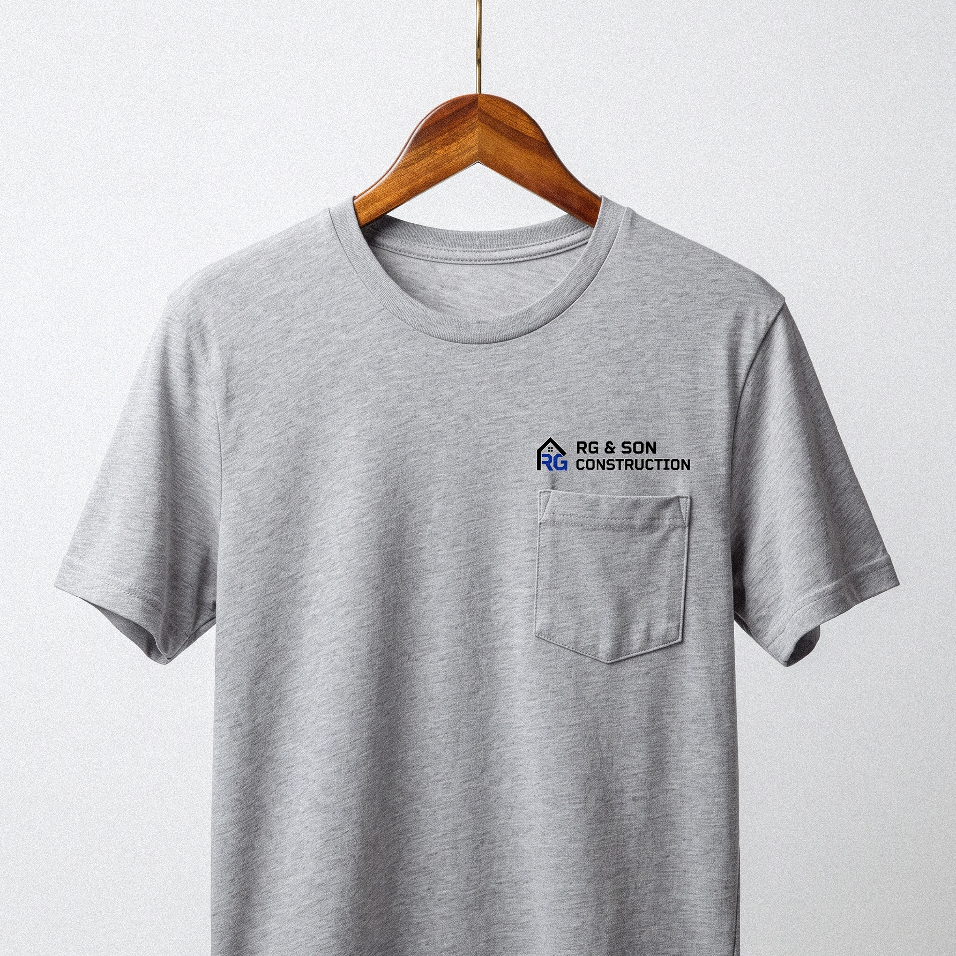
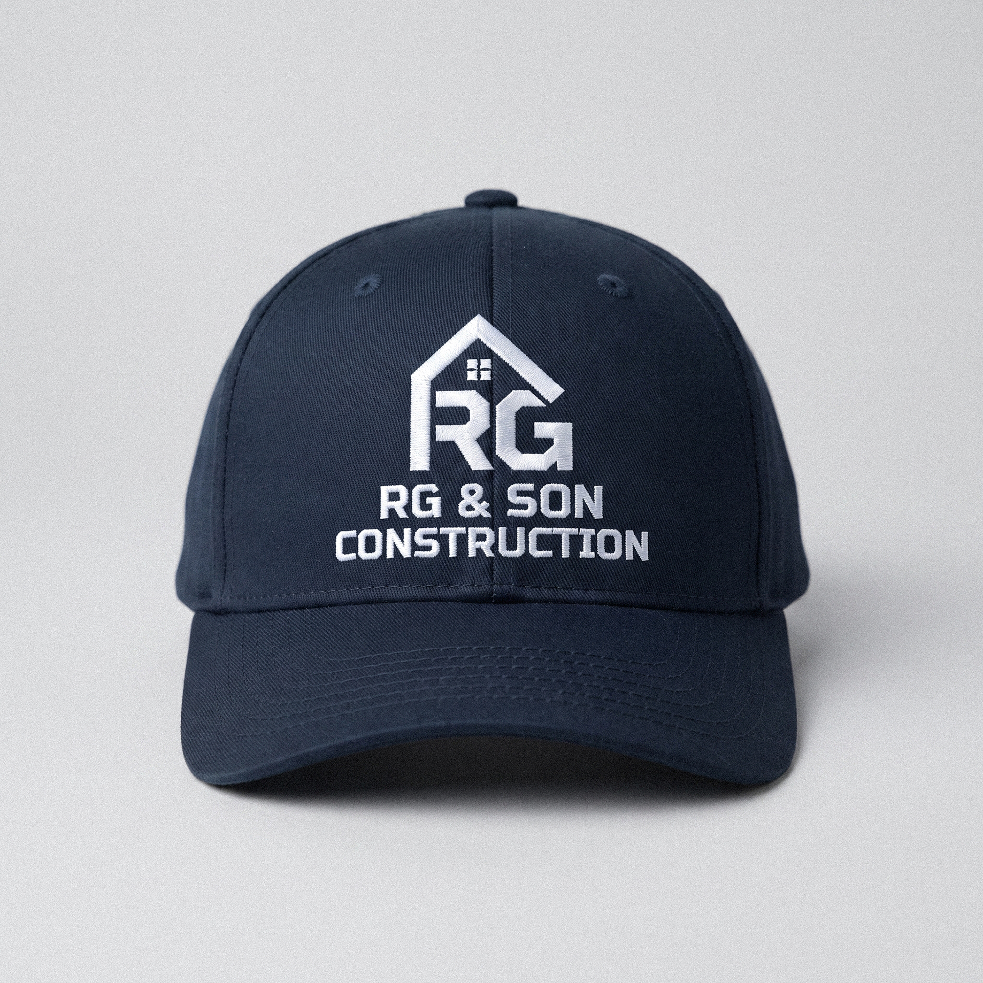
For this project the client only needed two orientations for the logo, horizontal and vertical. The horizontal use case is the main mark and to be used on t-shirts, decals, and business materials. The vertical secondary logo is meant for hats or other use cases where the horizontal logo would not benefit the brand.
The idea behind the logo mark needed to be intentional and familial. The initials "RG" belong to the father of the business, the mark itself is intended to show the R creating the foundation, or backbone of the company, where as the roof extends over the G, their last name, to elaborate on the idea of it being a familial umbrella.
The idea behind the logo mark needed to be intentional and familial. The initials "RG" belong to the father of the business, the mark itself is intended to show the R creating the foundation, or backbone of the company, where as the roof extends over the G, their last name, to elaborate on the idea of it being a familial umbrella.